Requirement
- Appraisal of the style of 3 to 4 published landscape photographers
Purpose
- To learn to analyse and recognise the style of other photographers
Technical learning
What is style?
See notes in Pages - ways of seeing and the use of technique to communicate this vision
Gerry Badger (in Without Author or Art: The Quiet Photograph).
- Every serious photographer needs to get his/ her work noticed, a creative calling card. The conventional way of doing this is to develop a recognisable style. Style comes from conscious refinement of composition, camera craft, subject matter or message of what lies within the unconscious persona. However, style is a reductive influence on a photographer's work, forcing consistency within his/ her portfolio.
What are the elements of style?
- Subject
- Message
- Composition
- Use of light
- Camera equipment/ format
- Use of colour and/or black and white
Some photographers to explore
- Fay Godwin, Land (1985) and Our Forbidden Land (1990)
- Galen Rowell, Mountain Light (1988)
- Edward Weston, Edward Weston: Photographer (1965) and My Camera on Point Lobos (1968)
- Richard Misrach
- Eliot Porter, Eliot Porter (1987) and Intimate Landscapes (
- Robert Adams,
- Franco Fontana
- David Muench
- Andre Martin, Image d'une France (1972)
- Joel Meyerowitz, Cape Light (1978)
Exercise instructions
- Prepare an appraisal of the style of 3 to 4 published landscape photographers (100 words)
Images and Review
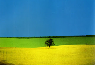
Franco Fontana
- Subject - Bare but man altered landscapes, absence of human figures,
- Message - Visceral pleasure of revealing form in the landscape
- Composition - Strong use of shape by abstraction of contrasting landscape elements, powerful use of lines to stimulate the eye, cloudless skies (or sometimes nearly so), wide tonal range of colours
- Use of light - alignment of shadow with (and to emphasise) shape,
- Camera equipment/ format - use of telephoto lens to isolate shapes and colour in his landscapes, (wonder if these cloudless skies are shot near to dawn or dusk with the sun behind the camera - shadows of an elevated sun are missing)
- Use of colour and/or black and white - emotional pull of colour is the key to the impact of his images
Personal reaction
Despite having an unnatural even dream like quality, these images grab my interest strongly due to the use of colour and shape. In that sense they have a meditative effect, even though I have no sense if the work has an underlying meaning or comment on land.
 |
| Club Mediterranée, Ibiza, Spain (1992) |
 |
| Imaginary Landscape, Italy (1998) |
 |
| Sunday Salon |
 |
| Basilicata, Italy (1978) |
Eliot Porter
- Subject - detail of nature (trees in leaf, rocks, etc) in between the big vista and the macro image
- Message - you can find nature's beauty, grandeur and fragility in the smaller space
- Composition - seek out texture, pattern, colour and reflections. Horizon often missing. Many images are close, if not actually, abstract in nature
- Use of light - frequent use of overcast or shade, rather than light of the 'golden hour'
- Camera equipment/ format - uses lenses between
- Use of colour and/or black and white - strong use of colour
Personal reaction
The close-ups force me to look at the detail of the subject which in a longer framed shot might get lost by other distractions. This is a style that I like as it gives a new perspective. The close up also brings out colours which tend to be drowned out by dominant greens in more panoramic shots.
Richard Misrach
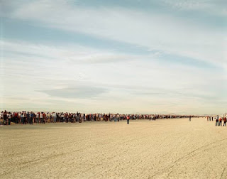
- Subject - Western America, often desert scenes (as in Desert Cantos), seeming wilderness and wide expanse of land with some trace of man's presence (usually a destructive one)
- Message - Man's despoliation of the naturally beautiful landscape of the American West, all wilderness has now disappeared (in contrast to Ansel Adams' work in capturing remaining pockets of unspoilt land)
- Composition - Human presence or evidence of it occupies only a small part of the images space but strongly attracts attention by striking a note of discord in an otherwise harmonious scene.
- Use of light - Light is usually soft , tones are generally on the light side of the range
- Camera equipment/ format - Large format camera, sharpness through out image (probably wide angle lens set with a small aperture)
- Use of colour and/or black and white - colours tend to be soft (in keeping with the light)
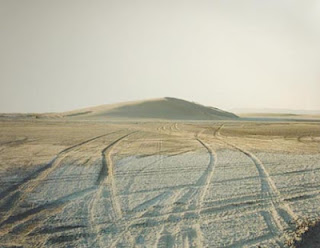 |
| Battleground Point#2 (1999) |
 |
| Bomb Crater and Destroyed Convoy (1986) |
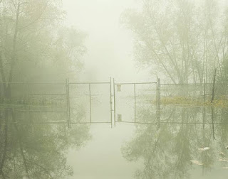 |
| Hazardous waste containment site, Dow Chemical Corp |
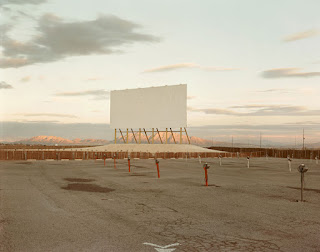 |
| Drive-in theatre, Las Vegas (1987) |
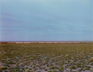 |
| The Santa Fe, Nevada |
+Richard+Misrach.jpg) |
| The Shuttle Landing (1983) |
Personal reaction
These images are composed both to show the conventional beauty of wilderness as well as the harmful effects of man's activity on the land, commercial or military. Neither dominates the other. This contrasts is a very effective way of delivering the message.


+Richard+Misrach.jpg)


No comments:
Post a Comment